Mikel Bruce is the CEO of TinyFrog Technologies, a San Diego web design agency specializing in WordPress web design & development and secured hosting & maintenance. Founded in 2003, TinyFrog Technologies offers a conversion-based approach to web design and has built over 1,100 websites.
How to Create an Effective Coming Soon Website for Your Business
Think back to the last time that you literally sat on the edge of your seat with anticipation. Maybe it was in the last 5 minutes of an incredibly close sports championship. Or when seeing your favorite band live in concert for the first or seventh time.
An effective coming soon page for a website should elicit a similar response from your visitors.
It’s an opportunity to make a strong initial impression and generate excitement for your business. A professionally crafted coming soon website can also help you to attract investors, secure more funding, and establish your online presence before the full site goes live.
Read on for a full guide to what you’ll need to build a successful coming soon website.
Why invest in a coming soon website?
There are many reasons why you should utilize a coming soon landing page for your upcoming business. From creating a buzz to securing more funding, let’s take the benefits one by one.
Establish credibility
A website helps to establish credibility. And a temporary site establishes your online presence before your full site or business is ready to launch. If you’re starting out, even just a coming soon landing page will help to demonstrate your presence to potential clients and investors.
It also gives you a reason to put your site’s address on your business cards and a place to direct new contacts. On a technical level, you’ll also jumpstart the indexing process and be picked up by search engines without delay.
Obtain funding
A temporary site can help to attract investors and interest in your business early on. On a visual level, you can showcase your brand, launch timeline, and how you’ll approach your target market. From a validation standpoint, you can take site visits, actions on-page, and a number of other factors to display interest to investors.
You could even set up pre-sales through a coming soon landing page to raise funding. If your potential customers see the value and are willing to pay ahead of time, you could easily gain additional startup funds in exchange for a pre-order bonus or exclusive trial period. And as an added bonus, this simply validates your business for potential investors even further.
Build an email list
Lastly, you can easily kickstart your marketing efforts by building an email list. Just add an email sign-up form for web visitors who are interested in learning more about your business.
You can simply start by sending launch and product updates, behind-the-scenes photos and videos, and even just informational content to get your customers excited.
Then leading up to launch, you can ramp up the consistency of your email marketing. Encourage your early adopters to spread the news, get excited about launch events, and even share exclusive promotions for signing up early.
Brought to you by
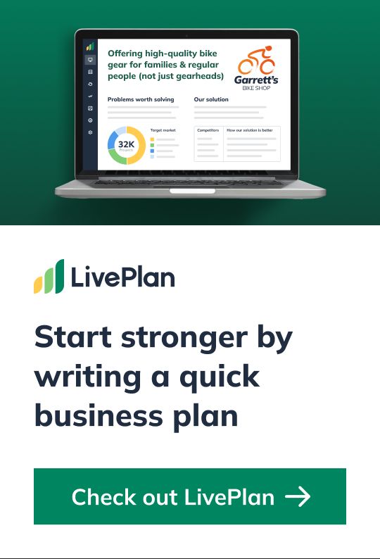
Create a professional business plan
Using AI and step-by-step instructions
Create Your PlanSecure funding
Validate ideas
Build a strategy
Design & content tips for a coming soon page
Your temporary site doesn’t need much—it can be a one-page site with basic company information and contact details. In general, a coming soon website typically includes these elements.
Captivating hero image
The hero image is the place where first impressions are made. Make the most of it, and invest in a high-quality image or short background video. If you choose a background video, be careful not to use one that is really distracting, or counter to your business’ purpose or ethos.
Also, be sure that the image or video isn’t housed within a massive file size. It may just be a one-page lander, but if it fails to load within a few seconds, you’ll see more and more people leaving without engaging with your site. Utilize an image compression tool and test your page speed from time to time to ensure you’re site is optimized for visitors.
Company logo
Like the hero image, you want a distinct identifier for your business, which is why it’s vital to include a logo. Don’t worry if it’s just a placeholder for the time being, anything that allows customers to connect with your business is useful. You can always update it with an official version once you’re closer to launching your full site.
Web-based value proposition
Different from your mission statement, your web-based value proposition quickly states who you are, what you do, and what differentiates you from any competition. The value proposition is typically placed over the hero image and it should be 1-2 phrases since web visitors need to be able to scan and read the content quickly.
It can be a simplified variation of your mission statement and even a catchy tagline if you have one prepared. If you find users leaving your site without taking action, it may be worth testing new variations of this statement to see if it resonates more.
Contact information and social media handles
Web visitors will most likely be asking themselves—How can I contact this business? Is this business in operation?
Include a phone number, email address, and physical address (if you will be operating a physical storefront). For some customers, they may feel more comfortable following or chatting with you through social media. If you’ve built out Facebook, Instagram, or Twitter profiles, include links to them here so that they can easily connect and follow your business.
Basic information on products/services and launch timeline
At the start, you can just include a simple one-line statement about what your product or service will be. But as you nail down product specs, service models, and a launch timeline, you’ll want to add them to this page.
The more context you can provide users and the more industry-specific keywords you can plant on your page, the more likely that people will find and sign-up for more information.
Email subscription form
Speaking of signing up, you’ll want to include some sort of subscription form on your page. Even if you only plan on sending product updates or general marketing emails, this is vital for building an initial audience. And as we said before, it’s also a simple way to validate your business idea and can help you get more investment interest.
Selecting a website platform
There are numerous website platforms available to host your coming soon site. It’s up to you to figure out which option makes the most sense for you.
In general, you’ll need to consider the ease of use, customization options, and scalability of the website platform. The following are the most common options you’ll find yourself considering.
WordPress CMS
A lot of businesses use WordPress, the most popular content management system in the world, starting with a WordPress theme or template. The platform is very flexible and customizable, so the website can grow and expand with your business.
While you don’t need to build your full website on the same platform as the coming soon page, it might simplify things to invest in a versatile builder like WordPress for both projects.
DIY platforms
If messing with web design really isn’t your thing, a DIY platform like SquareSpace or Wix may be a better option. This is an inexpensive and quick way to build your own site, that doesn’t require any web design knowledge to implement.
Be careful though, if you don’t have a strong eye for design elements, your coming soon site may end up looking generic or complicated.
Working with a web agency
Lastly, if you’d rather focus on other elements of your business and leave the website up to professional, you may want to consider hiring a design agency. One major benefit is that most web designers and agencies will include a temporary coming soon page as part of a larger website design project.
And don’t worry, you’ll still be able to give guidance as to what you’d like on the site, you just don’t have to worry about actually designing it yourself.
Common mistakes to avoid with your coming soon website
As you can see, there is so much to be gained from a strong coming soon page. But it can also become a detriment to your new business if implemented incorrectly. Here are three common mistakes you should avoid when setting up your site.
1. Settling for a default design template
Your website may be the first impression of your business for most customers and investors. A low-quality template website does not convey professionalism in the way that a well-designed site would.
If it’s your only option, it might be better to forgo the temporary site rather than give the wrong impression with a default design & messaging for your business. Instead, while you are balancing investments at the start of the business, make sure to allocate funds for a quality website design when you’re ready.
2. Lack of information and contact options
When landing on the temporary page, your visitors will likely be wondering if you’re open for business yet. If your company is not yet fully operational, make sure to provide up-to-date information and an anticipated launch date on the website page.
If there’s no relevant information for the web visitor, there is no reason for them to stay on the website—or return to it.
Depending on your business launch, your temporary website may be up for a few weeks or months. Make sure the site always has the most up-to-date information on your business as things change. Additionally, if you have built an email list, be sure to convey that same information to your subscribers or direct them back to the site for the latest updates.
3. Using a temporary website for too long
Even if most of your business will come from referrals, it’s very common for potential clients to search for a business online before reaching out. While a temporary site can help you in the short-term, some businesses make the mistake of relying on one at length.
As your business grows, the temporary website page can create the wrong impression and lead potential clients to think that you are still not open for business. Design trends also change quickly, and you’ll typically need to redesign a website every 3-5 years to stay up-to-date.
Additionally, a 1-page website is not the best practice for search engine optimization (SEO). Search engines favor websites that have more information and content that will keep visitors on the website longer. And even if you did get ahead in the indexing process by having a temporary site, all that momentum can be lost if it’s never updated.
Leverage your coming soon website for long-term success
Establishing an online presence, even with a simple website, legitimizes your business in the eyes of potential clients and investors.
Just be sure you utilize it as a springboard for your business, building a customer base, validating your idea and expanding it into a full-fledged company website. With the right approach and implementation, you can propel your business from a simple teaser page into a successful company.


 By
By 
